October 3, 2011
Halloween Card and Video
October 8, 2010
Copic Tutorial--Bricks
Hello Everyone. Ready for another Copic tutorial? This time it will be about using your colorless blender (O) to create a "brick pattern"! I will be using the fun TSB image that is available in the shop now!
Lets get started!
------------
STEP 1
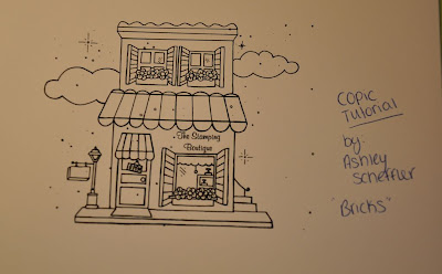
Here is the image that we will be coloring today and creating a non card project with.
STEP 2
The first thing that you will want to do is grab a peice of scrap white cardstock (the same kind you printed your digi image off from). You will want to practice the brick technique because it will push the
color slightly out and could ruin your image if you do not see how it feels at first. This is of course hardest with dark colors such as the brown I will be using (E37). Go ahead and color or scribble a nice area for you to practice in.
STEP 3
Once you have the color you will be using scribbled on a scrap piece of paper, grab your colorless blender (0) and for the next steps we will be using the BROAD tip. I always love doing this technique because I feel like I never get to use the broad tips of my markers!
STEP 4
For this picture I had my husband take a picture of me doing the technique, so this is how you would see me doing it. But in your hand you will hold the marker so the longer part of the broad tip will hit the paper first on the left hand side
STEP 5
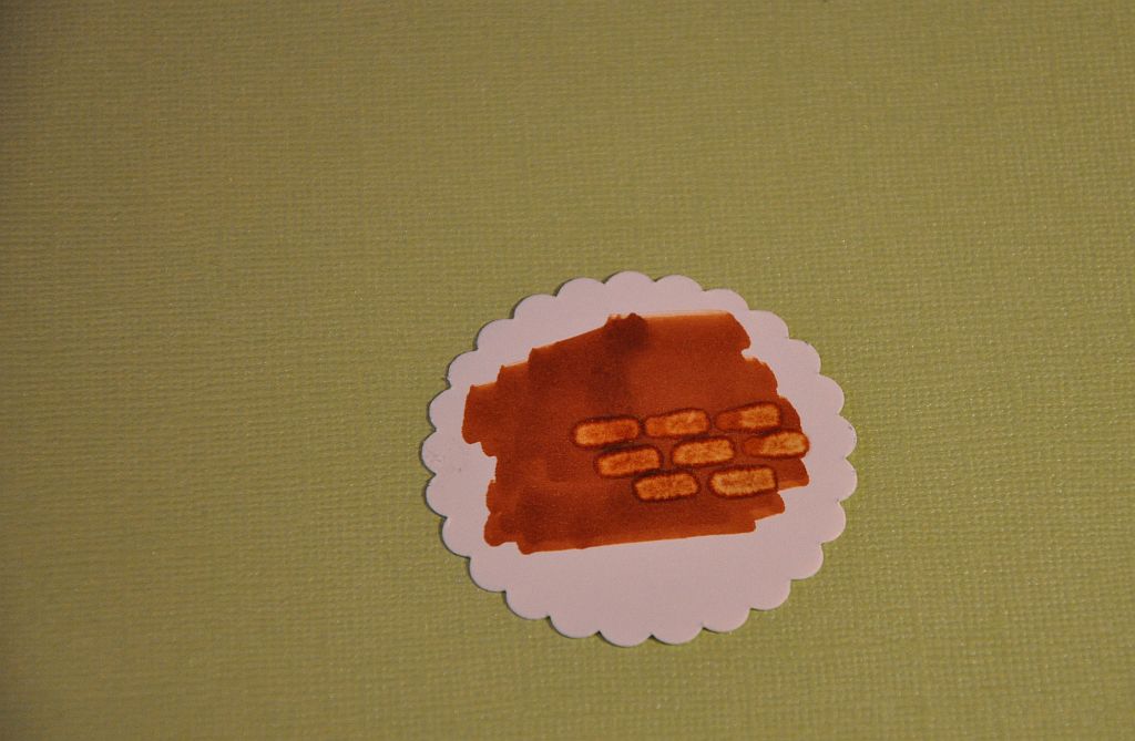
Then slowly "roll" the broad tip down so the rest of the tip is touching the paper flush. Hold for a few seconds. You can practice holding at different seconds. Of course the longer you hold it down the more color is erased and can be spread.
STEP 6
Try it out a few times and you can start to see the brick pattern!
STEP 7
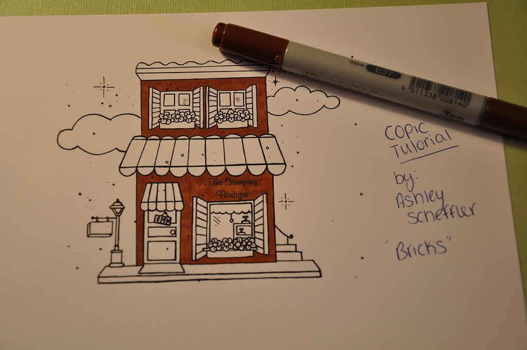
When you are ready to try it on your digi image go ahead and color the entire building. I stayed with E37 but if you didnt like the color you chose first then pick another one.
STEP 8
Here is the building done. Where you cannot fit the whole tip just sort of drag the tip (from the longest end) to get rid of the color and look like the technique. BUT you can see where the color runs because the colorless blender pushed it out. Go back over it with the brush end of the blender and using a sweeping motion, push it back to the line of the image. It should get rid of alot of the messed up lines. This is why it is very important to use great paper with Copics!
STEP 9
Color in the rest of the image. Here are the colors I used:
Bricks- E37, 0
Canapy/Curtains- RV04
Sidewalks/Plant boxes- C5
Flowers/Doormat/Sign- Y08
Street light/windows/store- W-5
Clounds/Shutters-BG10
STEP 10
I wanted to create a non card project so I created a gift bag. This is perfect to give your stamping friend some extra goodies you will never use or have duplicates of and make their day or birthday!! I also added "For You" on the empty sign holder with a Copic Multi-liner.
I hope you enjoyed this technique!!
August 4, 2010
Part 2 of Copic Tutorial-Sand
STEP 1
Here is the image and how I left off from the last tutorial (coloring water). This time I am focusing on the sand part of the image. Gather up the colors you want for the sand. I decided to make the sand more brown and could pull in alot of different color familes to achieve the sandy look. I will be using colors : E51, E31, E33, E37, E57, E77. I also use a product called Mudd Puddles at the end as well for more detail.
STEP 2
Using the lightest color (E53..I know this seems odd since its a higher number, but it is the lightest one I am using out of the color choices) color the entire sand area.
STEP 3
Using E31 I wanted to start adding some shadows to the shells and sand toys in the sand.
STEP 4
Using E33, I just went over the entire sand area and did little dots of color. Just hold your marker upright and lightly press down. If you use too much pressure, the dots will expand as the ink soaks into the paper and become larger.
STEP 5
Repeat step 4 but with the colors E37 and E57.
STEP 6
Now it's time to blend and have the dots not stand out as much. I used E33 and colored over the area again. You could use a lighter brown for a lighter coverage.
STEP 7
I wanted to add back in those darker specks you see on a real beach, so I used E77 and did really small black dots randomly over the sand area to bring out the dots again.
STEP 8 (optional)
I really wanted the beack to appear as real life as I could so I used a product called Mudd Puddles. It comes in different colors and different textures. I used the type called Malibu and just put it on in different areas. It spread on so you can do a lot more coverage.
There you go...
I hope you found this technique helpful. Next time I will be coloring in the rest of the image and making it into a card!!
July 15, 2010
New Copic Video..finally!
Here is the video of me coloring this adorable Bugaboo image with copics. Enjoy!
July 8, 2010
Copic Tutorial--Ocean/Water
It's Thursday and that means its another Try it Out Thursday Copic technique..featuring myself on The Stamping Boutique Blog.
Intro- Part 1 of coloring Sunny Baby With A Hat by Ashley Scheffler
Hello Everyone. This time I am doing something a little different. I won't have the image completely colored at the end, but instead next tutorial will be continuing with her since there are a lot of fun techniques you can do to the image! Today's technique is going to be about coloring water or ocean.
Lets get started!
STEP 1
Here is the image we will be coloring today. Perfect time to be coloring a beach image!! You will want to pick your color combos (blues or blue-greens). I use a lot of combos but I seem to always use this one for an ocean image where it is normally darker at the end of what your eye sees and lighter in the front where you first see the water. I will be using B97, B95, B93, and B12. A lot of times I will throw in BG10 as well. I will also be using a white gel pen for highlighting.
STEP 2
Take your darkest color (B97) and shade in the farthest away point and a few of the waves on the bottom where the light would not hit.
STEP 3
Now take your medium color (B95) and go over the darkest color and bring it down more into the front of the ocean.
STEP 4
Take your next lightest color (B93) and continue going over the last two colors and keep bringing it down closer to the beach.
STEP 5
This is where I used B12 and colored in the rest of the water area and went right back over the entire water area to help blend the colors together. I had to do this several times to get the look I wanted.
STEP 6
Of course when you bring your lightest color over your darkest, it will fade it. Repeat steps 1-5 over until you get your desired blending look and how dark you want your darkest color to be and what the contrast will look like.
STEP 7
This is optional but I really like the way it makes the water look and breaks up all the blues. Copic sells opaque paint but I just use my Uni-Ball Signo white gel pen. Just be sure to let it sit and dry for a minute so it does not smear and ruin your coloring you just did! The white resembles the foam that the waves usually make as they roll and hit the beach.
I hope you found this technique helpful. Next time I will be showing you how to color the sand area on this same image!! Please leave a comment if this helped you and what other techniques you would love to learn with Copics!
June 24, 2010
Copic Tutorial--Coloring a white/clear image
Happy Thursday! Are you ready for another copic tutorial by Ashley Scheffler. This will be featured on the Stamping Boutique Blog later on. This tutorial is on how to color a clear or white image with copics. You don't use alot of markers at all..so I am doing two images for you!
This is an easy way to color those white or clear images (think wedding dresses, snowmen, animals and more!). You will first want to pick out your color combos that you want to use. The most popular combos for white/clear images are:
- BG10
-The C's (C3, C1, C00)
-The W's (W3, W1, W00)
I typically use BG10 with any image that is suppose to be frozen, cold or an outside image. I use the C's and W's for items with more warmth, such as clothing or wings. I will show you an image with the C combos and W combos!
Lets get started!
------------
STEP 1-
Here are the two images I will be coloring today. Wedding Audrey will have a white dress and veil and Cynthia the tooth fairy will be holding a white tooth.
STEP 2-
Pick out your color combo for wedding Audrey. I will be using C3, C1, and C00.
STEP 3-
Using your darkest color, shade where the dress would be the darkest (no light hitting) and on folds in fabric. Use a light hand...we do not want her dress to look gray or dirty. I also colored the veil.
STEP 4-
Go over the darkest color with your two lightest colors. Mine were C3 and C00. Remember not to color in a lot of the dress..just stick to shading.
STEP 5-
Here is what the shaded image looks like when finished.
STEP 6-
Continue coloring the image. The colors I used:
Dress/Veil: C3, C1, C00
Skin: E00, E21, R20
Hair: E37, E57
Bouquet: G94, BV00, Y02
Ribbon: V15, V17
Crown: V15
Starbursts: BG10
STEP 7-
Complete your card or project with the image!
My supplies used on card:
Image: TSB Wedding Audrey
Cardstock: Stampin UP, Bazzil Bling
Pattern Paper: KI lace cardstock
Other: Copics,Glossy accents, Hero Arts gemstones, Stampendous clear glitter, Prima flowers
STEP 8-
Now lets continue coloring Tooth Fairy Cynthia with the W's. I will be using W3, W1, and W00.
STEP 9-
Start with the darkest color and shade where the light does not hit (W3)
STEP 10-
Repeat the last step with the lighter markers (W1, W00). Remember not to color entire image so that the tooth still remains white and healthy looking!
STEP 11-
Here is what the entire image looks like when I am finished coloring it. The colors I used were:
Tooth- C3, C1, C00
Skin- E00, E21, R20
Dress/tights- G14, YG06, YG23, RV34
Hair- Y15, Y17
Wings: BG15, RV34, G14
STEP 12-
Complete a card or project with the colored image. I created a card with tooth fairy Cynthia and added a special embellishment of my own..a quarter for a cute add-on!
My supplies used:
Image: TSB Tooth Fairy Cynthia
Cardstock: Stampin UP
Pattern Paper: Doodlebug, Green piece was a scrap
Other: Copics, Corner Rounder, Hero Arts Gemstone, Glossy Accents, Circle Punches, Quarter, pop dots and glue dots
June 10, 2010
Copic Tutorial--Jeans
Just wanted to post my Copic tutorial that I have started doing over on The Stamping Boutique's blog. I am so used to doing video tutorials that this was a little different for me (have you tried taking a picture thats good looking for each step of your card making process?! LOL) It is a little harder than you would think. Cant wait to start the next one!
Intro- Coloring Aj's jeans with Copic markers by Ashley Scheffler
You will want to first pick out the color combo you wish for jeans. For this image I wanted a darker blue color. My rule is typically to pick at least 3 colors that go together. For example, I will be using B93, B95, and B97. You can pick lighter blues for a faded look. For a fun twist you can always make jeans a different color other than blue as well!
Lets get started!
------------
STEP 1
Here is the image Aj on swing, he is adorable and has a pretty good size area of jeans to play with. Again, I am using the colors B93, B95 and B97 (you can also use the colorless blender to make the jeans appear faded)

STEP 2
Image before I color him. You need to pick where the light source is coming from. I want the sun to be on the left, which means everything on the left hand side of his body will be lighter because the sun hits there first.

STEP 3
Taking your darkest color (B97) fill in the areas that will be the darkest. This is where the sun will hit last or in deep folds in the fabric.

STEP 4
Using the medium color (B95) go over the dark area you just colored and add some more color. Leaving enough area to color where the sun will hit first for the lighest color. To blend the colors together go over in little circles to evenly blend the Copics together.

STEP 5
Using the lightest color, fill in the rest of the image. Also go over complete jean area to help blend all 3 colors together.

STEP 6
Repeat the steps if you want to go back and make the areas darker to stand out more. When you color over the darker area with any lighter marker, it will take away some of the color.

STEP 7
Repeat with color B95

STEP 8
Repeat with color B93. Just keep repeating these steps until you get the desired look for the jeans and the color you want. Just be careful not to over saturate your paper or the color will start to run out of the image lines.

STEP 9
Pick a color combo for the patches. I decided to use R29 and R46. I also used 0 to lighten the patches to look worn.

STEP 10
Completed jean area. You can see exactly where the sun/light source hits first (lightest) and where it hits last (darkest).

STEP 11
Continue coloring AJ. Just remember to keep the light source in mind! Here are the color combos I used:
Jeans- B93, B95, B97
Patch- R29, R46, 0
Shirt- G02, G05, G07
Skin- E00, E21, R20 (blush/cheek color)
Hair- C1, C3, C5, C7
Swing- E53, E33, E35, E37
Shoes- E57, E77
Sky- B0000

STEP 12
Complete the card or project using your image. For my card I used:
Stampin Up cardstock, Neenah Cardstock, and the pattern paper is Making Memories. Buttons were from personal collection collected over the years, corner rounder.